The Sink-Side Glass Cabinet Rule Most Kitchens Get Wrong
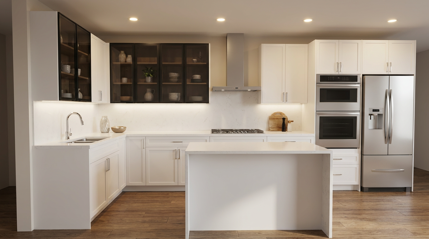
HGTV reports that glass-front kitchen cabinet doors transform ordinary storage into display space, and the placement decision matters more than the door style itself. This kitchen shows exactly what strategic placement looks like: black-framed glass display cabinets fill the entire upper run above the sink wall on the left side of the kitchen, while white solid uppers handle the working zone on the right — giving the layout a clear focal point without putting every shelf on view.
Why the Sink Side Is the Right Side for Glass
When you stand at the sink rinsing dishes or prepping at the counter beside it, the upper cabinets directly in your sight line are the ones above and around you on that wall. Glass doors turn those into a visual anchor you see every single day. The upper cabinets near the cooktop, the oven, and the refrigerator get opened and closed constantly during active cooking — exposure to heat and steam makes glass fronts a maintenance burden there, and fast access to everyday items matters more than display in that zone.
A standard 10-foot sink wall typically gives room for three or four upper cabinets. Standard widths run 24, 30, and 36 inches. At the usual 30-inch upper height — a W3030 or W3630 in the cabinet schedule — each unit holds two shelves, room for 10 to 15 items at a comfortable spacing. That is enough to display a cohesive set of dishware or glassware without crowding every shelf.
Cabinet Specs for the Glass Zone
Glass-front upper cabinets run at the same 12-inch depth as solid ones, which keeps the reveal line level across the full upper run. What changes is the door specification. A black-framed glass-insert door — the style in this kitchen — uses flat metal bars forming a grid. That profile is fundamentally different from a shaker door's raised rail-and-stile. Treat them as two separate door styles that belong in two separate zones, not interleaved in the same run.
Interior finish matters with glass in a way it never does behind solid doors. This kitchen uses a dark charcoal interior, visible through the frame, which makes the displayed ceramics and pottery stand out against a dark ground. A white interior with white dishware reads as flat. In the Flip designer, interior color is a separate specification from the exterior door finish, so the contrast can be confirmed before anything is ordered.
Height is worth upgrading for the display zone specifically. A 36-inch-tall upper (W3036) gives three shelves and significantly more visual presence than a standard 30-inch cabinet. That extra 6 inches is almost always worth specifying on glass-front units — more shelf area multiplies the payoff of the display.
Three Mistakes That Make the Glass Zone Fail
The most common mistake is putting glass doors on cabinets that hold everyday disorder: mismatched containers, partial spice jars, loose lids, boxes that do not stack. Glass amplifies whatever is behind it. The display zone needs items with some visual consistency — matching dishware, glassware in similar scale, or a curated set of ceramics. If the things you would put there are not ready to be on display, solid doors are the cleaner answer.
The second mistake is inconsistency between mullion styles in the same unbroken run. The black-framed grid insert in this kitchen has bold, flat graphics. A shaker door two cabinets away has an architectural raised-rail border. Those two profiles fight at close range. This kitchen avoids the conflict by using the chimney hood as a hard divider: glass zone ends at the hood, solid zone picks up on the other side. That gap lets each section read as its own element rather than a confused blend.
The third mistake is undersizing the glass zone. Two glass-front cabinets flanked by eight solid ones tend to look like an error rather than a decision. The glass zone in this kitchen spans roughly 8 to 10 feet of continuous upper cabinets. Below about 6 feet of glass-front cabinets, the display effect does not land.
Using the Chimney Hood as the Dividing Line
The chimney hood is doing two things in this kitchen: it vents the gas cooktop, and it acts as a natural divider between the glass display zone on the left and the solid upper zone on the right. That division only works cleanly if the upper cabinet mounting heights on both sides of the hood are level — a stair-step at the hood reads as a mistake, not a design choice.
For a 36-inch gas cooktop, the standard hood is 36 or 42 inches wide — at least as wide as the cooktop burner span, and ideally 3 inches wider on each side to capture steam at the burner edges. The chimney shroud, the vertical duct cover that runs from the hood canopy to the ceiling, needs a few inches of clearance from the face of the nearest upper cabinet on each side — typically 3 to 6 inches — so the shroud can be set plumb without butting against a cabinet box corner.
The standard clearance from a gas cooktop surface to the bottom of the hood is 30 to 36 inches; electric cooktops allow 24 to 30 inches. Upper cabinets on either side of the hood mount at the same height as they would anywhere else in the kitchen — 18 inches above the finished counter is the most common standard — but no upper cabinet should project over the cooktop surface itself. The hood is the only thing that belongs directly above the burners.
Who Should Stay With Solid Uppers Throughout
Glass uppers are not right for every kitchen, even one section of them. The case for staying solid throughout:
Kitchens that double as a catch-all, where anything stored behind glass is visible to anyone in the room — including guests standing at the island.
Short upper runs under 6 feet of continuous cabinets. One or two glass doors in a small run will not read as a zone; they will read as an inconsistency.
Cabinet boxes with unfinished interiors. The box must be painted or lined before glass goes on. An unfinished particle-board interior shows through the glass and looks like an overlooked detail rather than a design choice.
Kitchens with low light at counter level. Glass cabinets in shadow look dark and cluttered. Under-cabinet task lighting is the minimum; interior cabinet lighting is what makes a glass zone look intentional after dark.
Kitchens being staged for resale without curated dishware. Sparse or disorganized glass-front cabinets during showings tend to signal limited storage rather than design confidence.
How to Try This in the Flip Designer
In the Flip Kitchen AI designer, testing the glass-zone approach takes a couple of minutes. Lay out your upper cabinets across the full wall run as you normally would. Select the two to four cabinets on the sink side of the cooktop — wherever the sink lands in your layout — and switch their door style to a glass-insert option. Set the interior color on those specific cabinets to dark charcoal or slate; leave the rest of the upper run in your standard shaker or slab door. The 3D view shows immediately whether the zone reads as a deliberate design choice or a mismatch, before any numbers are locked.
To add interior cabinet lighting to the glass zone, select those cabinets and add the lighting option to each one individually. It appears in the cabinet specification and carries into your free quote automatically. The quote is where you see the full impact of the glass-zone decision in cabinet terms — how many door SKUs change, what the lighting spec adds, and what the total looks like. That is where real planning starts, not with estimates.